“Paytm” payment success page UX redesign
Paytm is a Ecommerce platform that offers mobile recharge, utility-bills payment and full marketplace to consumers. The main source of traffic for the company is from its Mobile App. With subsequent iterations of overall pleasent experience to its consumers.
Here in this project of mine I have tried to address a few UX loopholes that I have observed while using the Paytm mobile App.
Payment Success Page
The aim of this project is to identify the problem areas with current payment success page and suggest significant improvements, while maintaining the design consistency. I do not intend to redesign the whole flow rather just the final screen of the transaction which shows the status of the transaction.
The aim of the final transaction screen should be to give the users a satisfactory feedback to the status of their transcation. Thus the screen should be clean and intuitive with right elements placed at right position to grab the attention of the user while at the same time in case of a delayed or FAILED transaction tell the user of necessary steps to be taken and reassure them that their money is safe, thus building the brand trust.
The current Paytm payment Success page presents the useful information hidden among other non-relevant elements placed above the fold.
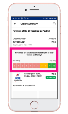
The current Screen highlights rating of the app more above the fold this creates following problems :
- The color coded rating screen has significant shade of pink which leads to a confusion that something went wrong (remember red being universal symbol of danger.)
- This also hides the Important message of the status of the transaction.
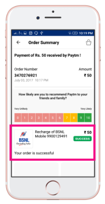
- Typography
- A call to action button that keeps user in the loop and takes him to further do more transactions.
Payment Success Screen
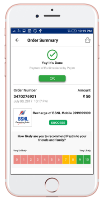
Yay it's Done
Addition of simple animated Icon to signify successful transaction. This presents a simple yet intuitive way of conveying the idea that the order is complete.
The addition of a Call to Action Button allows user to go back to main window once the transaction in complete thus retining the user even after checkout.
Rest of the elements of the screen are kept same to ensure that a drastic change in UI is not made.
Rating is moved to bottom of screen to ensure that a proper hierarchy of the elements based on their significance.
Failed Transaction Screen
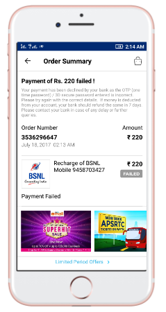
The current screen for a failed transaction fails at multiple levels to give a clear sense of what went wong and what the user needs to do next.
For a first time user who is trying an online platform to make a payment the failure of order may bring a lot of anxiety. The current screen lacks following:
- A visual cue to indicate that the transaction has failed.
- Clear Instructions as to what the user is supposed to do next.
- The current copy of the failure message is not good enough to ensure the anxious user that his money is safe.
- No call to action to make the transaction again, The user has to re-enter all the details again if they wish to make the transaction again, thus increasing the load on the user.
Suggested Failed Transaction Screen
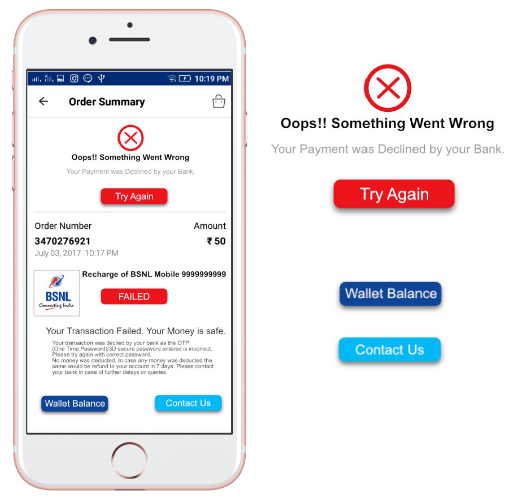
Simple Visual cue with animated Icon to clearly inform that the transaction has failed . A try again call to action to let user again try to complete the same trnsaction, without the need to go through the redundant process again.
Addition of option to check the wallet balance, to provide the user immediate relief of where their money is.
Contact Us button ensures the user that Paytm knows what has happened and that we are here to help , if they feel a need they can contact the Paytm which is just One Click Away.